NHS website enhancement
Business Analyst Task
UX work: Design and bespoke logo creation

The context
Executive summary
Hospital website stakeholder reported a difficulty with how editors were uploading information to the website. The hospital website was littered with out-of-date PDFs. They requested support and a means to print webpage information to eliminate the need for PDFs.
Discovery process - Interview
Before beginning UX work, I needed to scope out business needs, the root of editor behaviour and understand why and how does the proposed solution of an extra 'print' button benefit the primary user, what specifications did the stakeholder have for the button, and for what reasons, to map out the most effective solution.
I conducted an 40 minute meeting with the stakeholder.
Discovery
Off the back of interviewing, I mapped out the moving parts of the issues causing technical debt. For example, for primary and secondary users:
As-is scenarios
Jenny: secondary user of website (editor of website)
Jenny works as a nurse at a children's hospital and she is rushed off her feet. Today she was tasked with updating the website content about severe combined immunodeficiency. Jenny does not have time to go through editing old content and she is not a tech-savvy person who is comfortable with the Central Management System. She creates a word doc instead, and uploads that up as a PDF.
Anna: secondary user of website (moderator of website)
Anna creates content, moderates thousands of webpages and has multiple projects to prioritise. She sees a request to approve an additional PDF with medical jargon. She checks the wording for this PDF, however the webpage itself still has outdated information. There are many incidences of this.
Geetha: primary user of website (patient / family member)
Geetha's son, David, has severe combined immunodeficiency. Geetha is visually impaired and uses a screen reader. She has an appointment coming up with David's doctor and wants to read up on David's condition to get the most out of it. She goes on to the hospital website and when she does, the information is in a PDF. She used the 'find' keyword command on her keyboard to target specific information, but it did not work on the PDF. She prints the document to take to the appointment, as planned, but has not yet been able to read the content herself.
Summary of 'as-is' scenario
-
Content editors are uploading PDFs to the website due to time restrictions and confidence levels on using the website management system.
-
PDFs do not allow patients and researchers to easily find content they are looking for (e.g. via 'ctrl, F' function).
-
There is an underlying accessibility issue, since PDFs do not work with screen readers.
'To-be' Solution
Must haves:
-
Print function (to be used in lieu of PDFs)
-
'How to' guide for staff on updating content on CMS
-
Review of existing PDFs / content on website (part of wider project)
Nice to have:
-
Staff training on updating CMS content (capacity dependent)
User Stories
Having identified the 'as-is' pain points behind the technical debt, I scoped out the design specifications of the 'to be' solution.
Patients: Primary user
As a visually impaired patient/parent of a patient, I need to use the search toolbar to navigate to information regarding my child’s medical condition and be able to use my screen reader to read it as well as print the information off, so that I can make the most of my hospital appointment.
GIVEN I am looking for information on a medical condition
WHEN I am on the hospital website
THEN I can use a screen reader, search toolbar and print function to access content
Researchers and lab staff - primary users
As a researcher, I need to use the 'control & find' function on my keyboard to index information about the hospital research and print it off to study it on the commute to work
GIVEN I am looking for information on hospital medical research
WHEN I am on the hospital website
THEN I can use 'ctrl & F' to search key words, and I can print off the information directly from the webpage.
Staff - secondary users
As a member of staff at the hospital, I need to print information about a child’s medical condition and diagnosis on behalf of the parents, to give to them at the appointment.
GIVEN I am looking for information on hospital medical information
WHEN I am on the hospital website
THEN I can quickly print off the information directly from the webpage, in one click.
UX design phase
Bespoke logo specifications
Acceptance Criteria. 'Print' icon must:
-
be at the top / not too much scrolling on long pages of information
-
not take up too much space on an already long pages
-
be easy to find, without confusing information hierarchy
-
be in keeping with the style of the webpage (size, colour palette)
-
be accessible (colour contrast)
-
have silent, hover and clicked states
-
have easy specifications for the developer to action within the 2 week sprint
First mock-ups
Desktop
The stakeholder requested the icon / CTA fit on the left hand side, underneath the side bar. I mocked up what this would look like, and whilst offering alternatives outlining the pros and cons for the primary user / patients on the site.
I was careful not to over-engineer the button, as the CTA was required to fit in to the understated style of the NHS website without confusing the information hierarchy.
In my mock-ups I note the specifications for the developer.
I presented the mock-ups with my recommended option first, outlining the rationale, before providing alternative placements and colours, for visibility of options.
Recommendation
I presented the mock-ups with my recommended option first, outlining the rationale, before providing the alternatives.
.png)
Iteration: Mock-ups
Additional requirement
-
allow editors to use print button without using the side bar
Key stakeholders had been discussing on which pages the new print button would feature. It was requested that the CTA not affect the layout of the page if the sidebar was not used.
My recommended option was agreed upon by the stakeholder and developer.

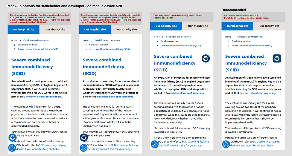
Mobile Mock-ups
The recommended option was to avoid a circle, which looked too similar to a Floating Action Button. A perfect square, however, was not the UI favoured by stakeholders. Rounded edged square was the final decision.
.png)
Creating bespoke icon
Once colour schemes, specifications, placements and functionalities were agreed, I created an SVG in Figma, for the developer to use on the website.
