top of page
FitSpurt
Accessible fitness app for people on the go

Role:
UI design
Duration:
3 weeks
Skills:
Sitemapping
Moodboard design
Animation
Prototyping
Tools:
Figma
Pixlr
Problem Statement
People with sedentary jobs, long hours and commitments at home can find it difficult to fit exercise into their daily routines. Users need a way to fit exercise goals around their personal schedules.
We will know users will have achieved this when their fitness goals are realized without disrupting other commitments.

Hypothesis Statement
I believe that an app where users can search by interest, workout intensity and duration will allow them to chose exercises that they enjoy and have time for.
Define
User Personas
The user persona below illustrates the brief specs provided for this project.

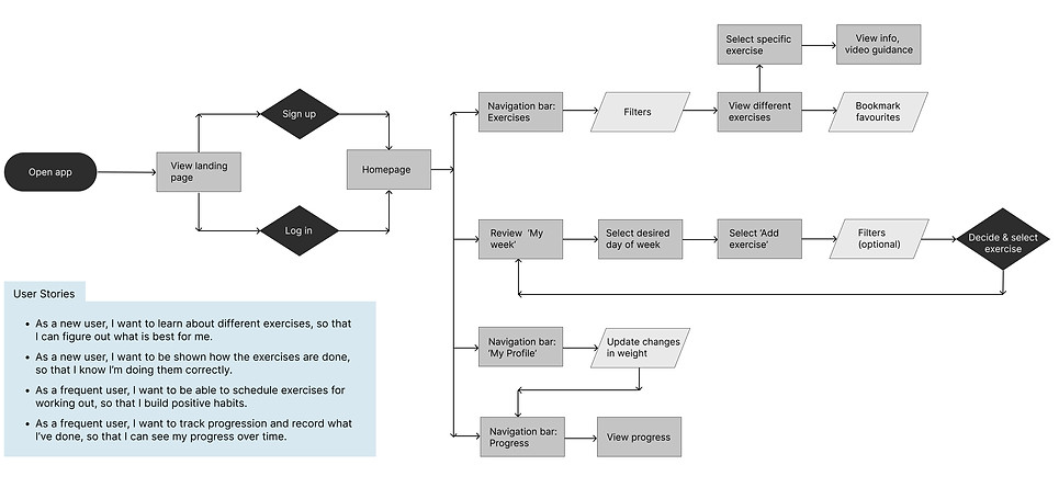
User Flow
I thought about Rebecca's frustrations, schedule restrictions, desire for exercise instructions and options that she'll enjoy. I then focused on creating a site map that would allow her to easily view a range of exercise options, exercise duration, tips/ guidance and plan when she wants to
Ideatation
Low Fidelity Wireframing
Using my site map that focused on a few key features for Rebecca, I sketched out the low fidelity wireframes and began to plan how Rebecca would interact with the design. A brief low fidelity clickable prototype on Marvel was created to check.

Mid Fidelity Wireframing
Once I was clear on structure and had checked user flow via prototyping in Marvel, I digitalized the wireframes to mid-fidelity.

Moodboard
'Choice', 'progress' and 'easy routine' are the keywords designed for someone like Rebecca in mind. Whatever stage of fitness one begins with, progress is achievable - even with little but often effort that fits into your routine. The colours and typography are aimed at being friendly yet informative, whilst following the project brief that orange and black must be included.

Style Guide
The style guide includes colour palettes, typography, use of image and creating complex body shaped icons from scratch.
For the full document, please click here

Style Guide
The style guide includes colour palettes, typography, use of image and creating complex body shaped icons from scratch.
.png)

Final Mockups
%202.png)

Responsive Design
I took a mobile-first design approach to prioritize content. I then designed for different breakpoints so the app will be compatible with tablet and desktop screens.


Learnings
Learnings
Learnings
Learnings
I learnt a great deal in this UI project. My key take away points were:
Colour:
In my moodboard, I created a colour palette that was clean, energetic and bright. However, I only had a couple of photos to offset the palette with. As this project is fairly photo heavy, I soon realized that once I populated the app, muted colours were most appropriate and reduced the possibility of clashing. I therefore chose main primary colour for CTA buttons and a colour to offset. This was sufficient and other colours are largely derived from the two base colours.
Navigation bar:
In my early sketches, I had design in a navigation bar. With a bit of research, however, I discovered that some browsers (such as Safari, Chrome and Brave) have their own toolbar on the bottom of the screen, leading to an awkward stack of toolbars at the bottom of the screen when using web app. Safari iOS also prioritises its own bottom navigation bar, making it awkward for users to interact with the web app navigation. I found that hamburger menu in this case was a useful design pattern that avoided these issues and also allowed me to capitalize on screen space.
Typeface:
I have learnt about making the most of bold titles whilst keeping body copy readable and clear through pairing of appropriate fonts.
Feel free to explore the app below

Photo credit: Unsplash, Adobe Stock, PixelBay and Pexels
bottom of page